Joining a new project can be intimidating, especially when it’s something as large and well-structured as ByteChef. My first task wasn’t about building a huge feature or solving a deep bug. Instead, it was something that seemed simple: migrating all Radix icons to Lucide icons. But as I started working on it, I realized that this small task actually had a meaningful purpose behind it.
The great icon switch
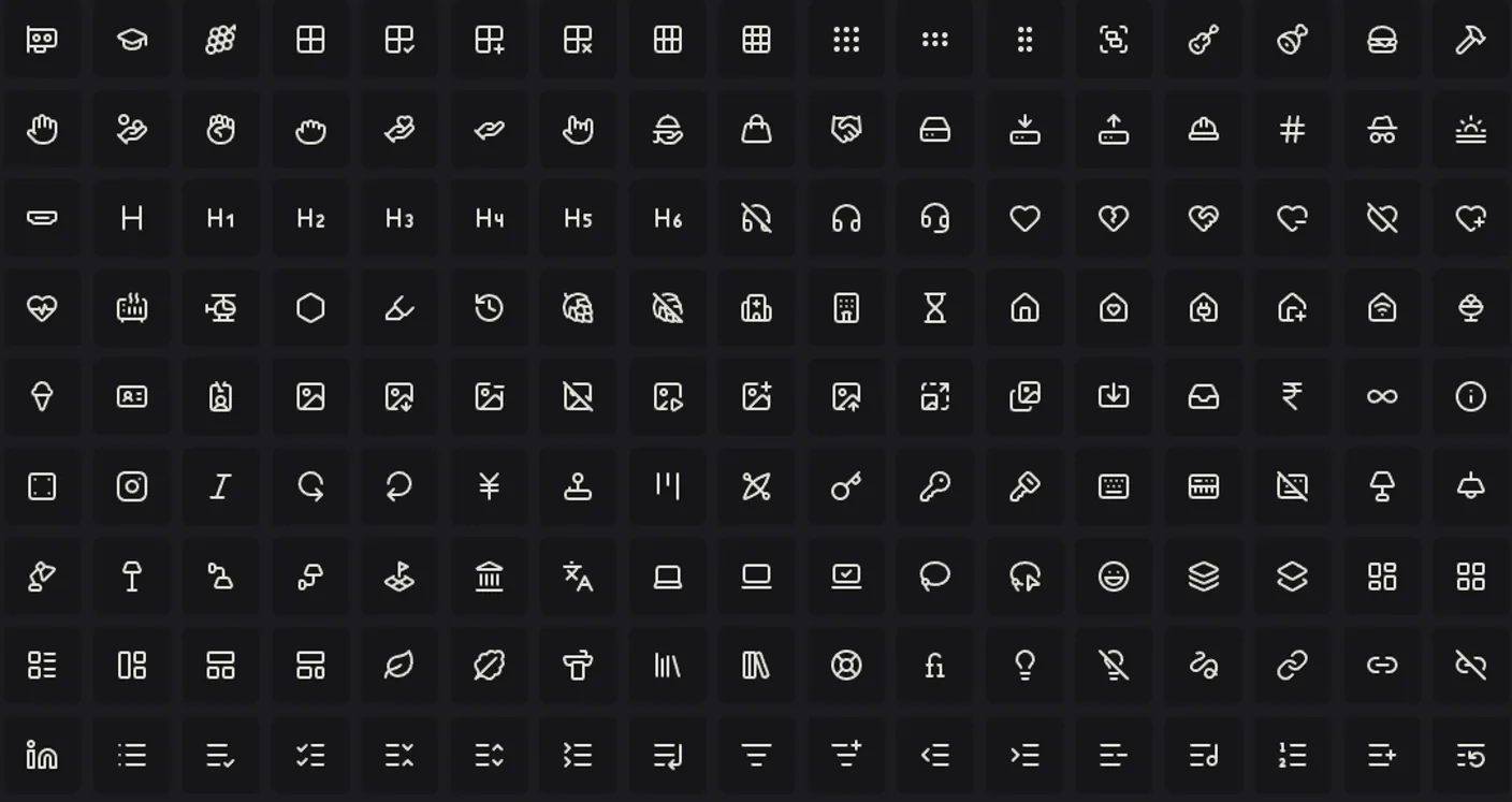
Before the migration, the project used two different icon libraries: Radix and Lucide. This setup worked, but it also created small inconsistencies across the codebase. Some icons were imported from one library, others from another, and it slowly became harder to keep everything visually and structurally consistent. The imports felt cluttered, and sometimes two components used icons that looked almost the same but were just slightly off in size or stroke width. It wasn’t something a user would necessarily notice, but developers did, and those details add up.
By switching entirely to Lucide, the ByteChef codebase became much cleaner and easier to maintain. All icons now come from the same place, which means imports are straightforward and predictable. The overall design feels more cohesive, and there’s less room for confusion when someone new joins the project. Plus, using a single dependency also helps reduce bundle size, which is always a nice bonus.
This was a great introduction to the project because it showed how even the smallest tasks can have a real impact on the structure and clarity of the code. It wasn’t just about changing icons - it was about understanding why consistency matters.
Spot the Difference
One of the tasks was exploring the differences between Radix and Lucide. Lucide icons immediately stood out as more modern and flexible. They’re open-source, have a clean aesthetic, and fit well with the design language used in ByteChef. It was interesting to see how design choices and technical implementation meet in something as simple as an icon library.
However, the migration wasn’t just about swapping imports. I needed to make sure the new icons matched the existing visuals - things like height, width, color, and borders all had to remain consistent. That’s where Tailwind CSS came in. With Tailwind’s utility classes, I could quickly adjust the icons and ensure they blended perfectly into the UI.
For example:
<Check className="h-4 w-4 text-muted-foreground" />
This little snippet made a big difference in maintaining a consistent visual style throughout the application. It was a small but important detail to get right. Design consistency depends on these technical adjustments, and developers play a big role in keeping a product visually polished.
Clean Code
The book Clean Code by Robert C. Martin talks a lot about simplicity, readability, and clarity. This task helped me experience those principles firsthand.
At first glance, it’s easy to underestimate small cleanups like refactoring icons. But one can quickly learn that these kinds of cleanups make a project easier to understand and maintain. When every import looks the same and follows the same logic, it removes small bits of confusion that can slow developers down. It’s one less thing to think about, and it frees up your mind to focus on what really matters: building features, solving problems, and learning new things.
In short, clean code isn’t just about aesthetics - it’s about clarity and peace of mind. And sometimes, you learn that best through the smallest of tasks.
// Before

import { CheckIcon } from "@radix-ui/react-icons";

import { XIcon } from "lucide-react";

// After

import { CheckIcon, XIcon } from "lucide-react";
This migration was my first small contribution to ByteChef, and it taught me that even the smallest tasks can help you understand a project’s structure, its style, and its goals - one pull request at a time.