5 min read
Krešimir Čoko
TL;DR: ByteChef's menus all used shadcn/ui's
DropdownMenu, and each one styled it by hand with global CSS classes and one-off overrides. We added a thin wrapper that maps every part to our design tokens and gives items a simpleiconandlabelAPI, then moved the app onto it one area at a time. That took 23 commits across 141 files and turned two copy-pasted menus into shared components.
Open any list in ByteChef (projects, connections, deployments, knowledge bases) and each row ends in a ⋮ button. Behind those buttons are dozens of dropdown menus built on the same shadcn/ui primitive, and almost no two were styled the same way.
This follows our earlier posts on customizing the Badge beyond shadcn and building a custom Switch on top of shadcn, which wrapped other shadcn components the same way.
shadcn/ui gives you the source of its components instead of a package. That makes them easy to adapt, and over time every call site had adapted them a little. A typical row menu looked like this:
import '@/shared/styles/dropdownMenu.css';

<DropdownMenuContent align="end" className="p-0">
    <DropdownMenuItem className="dropdown-menu-item" onClick={onEditClick}>
        <EditIcon /> Edit
    </DropdownMenuItem>

    <DropdownMenuSeparator className="m-0" />

    <DropdownMenuItem
        className="dropdown-menu-item-destructive"
        onClick={onDeleteClick}
        variant="destructive"
    >
        <Trash2Icon /> Delete
    </DropdownMenuItem>
</DropdownMenuContent>
Styling lived in two places: a global stylesheet defined dropdown-menu-item and its variants, and each file had to remember to import it. The global classes needed p-0 on the content and m-0 on the separator to undo shadcn's defaults, so those overrides were repeated at every call site. Destructive items were marked twice, once with variant and once with a class, and nothing kept the two in agreement.
With menus in every list, sidebar and editor header, a small change to how they looked meant hunting through the codebase.
We kept shadcn's component underneath and added a thin components/DropdownMenu layer on top. It re-exports every part (content, items, checkbox and radio items, label, separator, shortcut, submenus) with our design tokens applied once:
const contentStyles =
    'rounded-lg border border-stroke-neutral-secondary bg-surface-neutral-primary p-1 text-content-neutral-primary shadow-md';

const itemVariants: Record<DropdownMenuItemVariantType, string> = {
    default: 'text-content-neutral-primary focus:bg-surface-neutral-primary-hover ...',
    destructive: 'text-content-destructive-primary focus:bg-surface-destructive-secondary ...',
};
Colors come from semantic tokens like surface-neutral-primary and content-destructive-primary instead of raw palette values, so menus follow dark mode and later theme changes without edits.
Most menu items are an icon and a word, so items take icon and label props, or children for anything custom. A small discriminated union makes TypeScript reject both at once:
interface LabelContentI {
    children?: never;
    icon?: ReactElement;
    label: string;
}

interface CustomContentI {
    children: ReactNode;
    icon?: never;
    label?: never;
}

type MenuItemContentType = LabelContentI | CustomContentI;
Destructive is a single variant="destructive" prop that sets both the color and the focus state.
The wrapper has Storybook stories for every part and its own tests, so it was documented and covered before any page used it.
Each commit moved one area of the app: data tables, the workflow editor header, knowledge bases, deployments, MCP servers, connected users, AI skills and others. That kept every diff small enough to review, and any regression traces back to a single commit.
Here's the same deployment row menu after the move:
<DropdownMenuContent align="end">
    <DropdownMenuItem icon={<EditIcon />} label="Edit" onClick={onEditClick} />

    <DropdownMenuSeparator />

    <DropdownMenuItem icon={<Trash2Icon />} label="Delete" onClick={onDeleteClick} variant="destructive" />
</DropdownMenuContent>
The stylesheet import, the spacing overrides and the duplicated destructive class are gone.
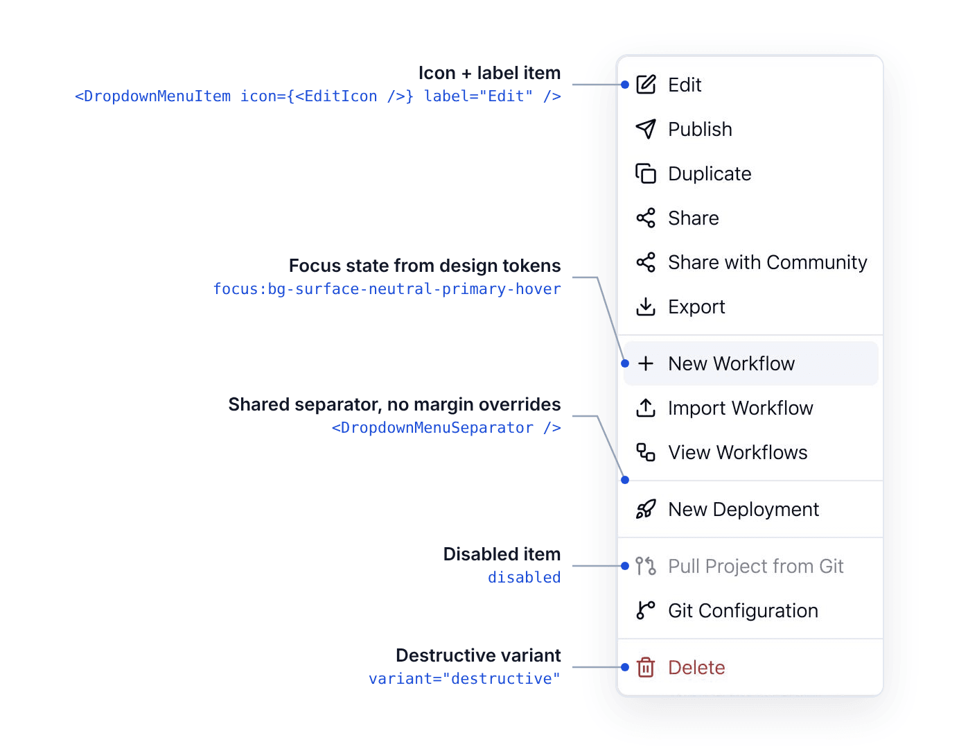
With every menu in front of us, some turned out to be the same menu written twice. The connection row menu existed once for Automation and once for Embedded, and the workflow row menu was duplicated between the project and integration lists. Each pair is now one shared component, so the next change to either happens in one place.
As of today, 76 files import the shared DropdownMenu. Another 23 still use the shadcn primitive directly, mostly settings pages, the API platform and the Automation Hub, and a handful still import the old stylesheet. Moving those is mechanical work now, and new menus start on the wrapper.
children handles the rest.The menus do the same things they did before. One component now decides how a ByteChef menu looks, so the next design change to menus is a one-file diff.
Curious how it's built? The wrapper lives in client/src/components/DropdownMenu in the ByteChef repo, stories included.